Affiliate disclosure: Daily Home Decorating may earn a commission if you buy through links in this guide, at no extra cost to you. As an Amazon Associate, we earn from qualifying purchases.
The best area rug for yellow walls depends on how strong the yellow is, how much daylight reaches the room, and which colors are already in the furniture. A soft butter-yellow wall can pair with ivory, warm gray, blue, or natural beige. A saturated golden wall needs a quieter rug or a controlled contrast. Mustard walls can support navy and cream, while pale lemon walls often look brighter with light neutrals and subtle patterns.
Color is only the beginning. Rug size, pattern scale, pile, material, backing, and care all affect how the room feels and functions. This guide explains how to balance different yellows with a rug, compare color families, plan the layout, and avoid common mismatches. Product examples are Amazon Creators API listings, not rugs we have physically tested. Verify the live listing’s exact size, color variation, materials, and care instructions before buying.
For room layouts and rug measurements, see our living room rug guide and explore more projects in Home & DIY.
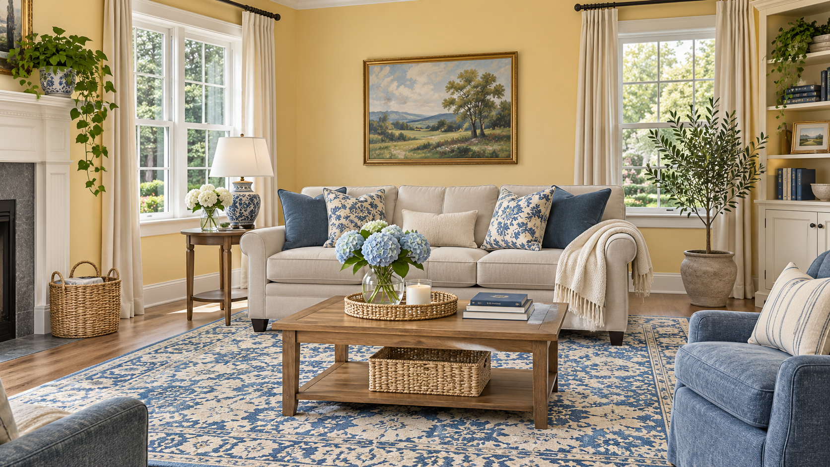
Quick picks for yellow walls
- Butter or pale yellow walls: try ivory, cream, warm gray, beige, or a soft blue-and-neutral pattern.
- Golden yellow walls: choose a quiet neutral rug, muted blue, olive, or a pattern that contains yellow alongside cream or gray.
- Mustard walls: navy, charcoal, cream, and faded blue can add contrast; repeat warm wood or beige to soften the look.
- Yellow room with dark furniture: use a lighter rug to lift the floor and define the seating area.
- Yellow room with pale furniture: a medium-tone or patterned rug can add visual grounding.
Before choosing, look at the wall in morning light, afternoon light, and under the lamps used at night. Yellow paint can shift from soft cream to strong gold as light changes. A rug sample that looks neutral on a website may reveal a pink, green, or gray undertone once it is on your floor.
Identify the yellow undertone and intensity
Yellow is not one color. Pale butter, lemon, goldenrod, ochre, and mustard behave differently beside other materials. Some yellows lean green; some lean orange; others look creamy or nearly beige. Hold a plain sheet of white paper near the wall and note whether the paint looks warm, cool, or slightly green. Then compare that impression with the floor, sofa, curtains, and wood finishes.
Intensity matters too. A muted yellow wall is easier to combine with a patterned rug than a highly saturated one because it contributes less visual weight. If the wall is the room’s strongest color, let the rug calm it with cream, taupe, or gray. If the yellow is pale and low contrast, the rug can bring deeper blue, charcoal, or green into the room.
Do not rely on a small paint chip alone. The wall’s large surface area changes how the color reads. View a large swatch or a sample board beside the rug and furniture. Compare them under the room’s actual bulbs as well as natural light. A warm white bulb may make golden paint more orange; a cool light can make pale yellow seem sharper.
Rug photos can also mislead because screens and photography alter color. Look for several listing photos, close-ups, customer images, and a written color name. If the rug is a major purchase, use a seller with a return policy that allows you to inspect it at home.
Color palette 1: ivory, cream, and warm beige
Ivory and cream are reliable choices for yellow walls because they reduce contrast without making the room feel cold. A cream rug works with butter yellow, pale lemon, and many golden shades. Warm beige can connect the wall to wood floors, leather furniture, or natural fiber baskets. If both wall and rug are warm, use a darker coffee table or patterned textile to keep the room from blending into one large beige-yellow field.
Choose an ivory rug with texture or a quiet pattern when you want the space to feel light. A solid pale rug can show spills and foot traffic more clearly, especially in a living room. A flecked, faded, or low-contrast pattern may be more forgiving while maintaining a calm appearance.
Warm beige can range from pinkish sand to yellow-brown taupe. Compare undertones carefully. A beige rug that is too orange may intensify mustard walls, while a grayish taupe can create a cooler counterbalance. Sample next to the wall and floor rather than against a white product page.
Color palette 2: blue, navy, and slate
Blue and yellow provide clear contrast. Navy can anchor a bright room and add definition, while dusty blue or slate blue feels quieter. A patterned blue-and-cream rug can link the wall color to white trim, neutral furniture, or a blue sofa. The goal is balance: if the wall is saturated, choose blue as part of a pattern or use a softer blue-gray rather than covering the entire floor in another bold color.
Blue rugs suit mustard and golden walls because the cool tone offsets the warmth. For pale lemon walls, a navy accent may be quite strong; use it in a rug pattern and repeat navy in smaller items such as frames or pillows. If there is already a blue sofa, a rug with both blue and cream can create a connection between the two large surfaces.
Check whether the blue leans green or purple. Teal blue may coordinate with olive and warm wood, while a cooler slate blue can relate to gray furniture. An exact wall-to-rug contrast is not necessary; consistent undertones and a repeated accent are enough.
Color palette 3: gray, charcoal, and greige
Gray can temper yellow walls, especially when the room also contains white trim, black accents, or modern furniture. Warm gray and greige feel softer than blue-gray. A light gray rug creates a restrained room, while charcoal patterns add definition beneath pale furniture.
Look at gray undertones before ordering. A cool gray rug may make warm yellow appear more orange, while a taupe-gray can blend gently with buttery paint. If the yellow is very bright, avoid a high-contrast black-and-white pattern unless you want a graphic room. A low-contrast gray design can soften the walls without adding another strong color.
Gray rugs with yellow accents can tie the palette together. But small yellow details should relate to the wall rather than trying to match it exactly. A close but imperfect match can look accidental; use a visibly lighter or darker yellow, or let the pattern include another connecting color.
Color palette 4: green, olive, and sage
Green and yellow can feel natural together because both appear in foliage and landscapes. Sage and muted olive are especially useful when the room has plants, warm wood, or cream textiles. A green-and-neutral rug can make yellow walls feel softer and less sunny without removing their warmth.
For golden walls, use a cool or muted green rather than a bright yellow-green. For pale yellow, darker olive can provide contrast. Add cream or warm gray so the palette does not become a simple wall-and-rug color block. Plants can repeat the green in different shades and textures.
Emerald and forest green are stronger accents. They can create a dramatic room with mustard or ochre, but use them in a pattern or a smaller part of the rug if the wall already dominates. Dark green also works with brass, walnut, and navy accents, provided the room receives enough light.
Color palette 5: rust, terracotta, and warm red
Rust, terracotta, and brick red can make yellow walls feel richer, especially when the yellow is pale or golden. These colors work best when one is clearly the accent and the other is the background. A patterned rug with small rust details can repeat a terracotta pillow or clay pot without overwhelming the room.
Mustard and rust are both warm, so a large amount of each may feel intense. Break them up with cream, beige, or light gray. If the furniture is dark, keep enough pale color in the rug to preserve contrast. If the walls are light, a medium rust pattern can ground the room without becoming too heavy.
Test the palette at night. Warm bulbs can make rust and yellow look more orange, while daylight may reveal a red or brown undertone. Product photos may have been adjusted, so use fabric or rug samples whenever possible.
Color palette 6: black, white, and natural textures
Black and white create a crisp, graphic contrast with yellow walls. This palette can suit contemporary rooms, but a bold geometric rug may compete with a bright yellow wall. If the room feels busy, choose a smaller-scale pattern or a faded design. Repeat the black in two or three smaller items so it feels planned rather than isolated.
Natural jute, sisal, seagrass, and woven-look rugs add texture and a sandy color that can suit soft yellow walls. They may be less forgiving around spills or moisture and can have a firmer feel underfoot. Check fiber care and whether the rug is suitable for the room’s traffic. A woven texture can also shed or feel rough, depending on construction.
Natural materials are not automatically neutral in color; they can vary from straw-yellow to brown. Compare samples against the paint and flooring. If the rug and wall are too close in warmth, use a contrasting sofa, cushions, or dark wood to define the space.
Pattern and scale: how much visual movement?
A patterned rug can bring yellow walls into the rest of the room. A design containing cream, blue, or gray may bridge the paint with sofas and curtains. Large-scale patterns read strongly from across the room, while small repeating motifs look more like texture at a distance. Consider the size of the room and the patterns already on the furniture.
If the walls are a solid, saturated yellow, a subtle rug can provide visual rest. If the walls are pale and the furniture is plain, a stronger rug can add personality. Avoid stacking several large-scale patterns unless there is a consistent palette and one pattern is clearly dominant.
Distressed or vintage-inspired designs can soften bright colors and may hide small everyday marks. High-contrast designs create a sharper look and can draw attention to the floor. Look at the whole rug photo, not only the close-up; a motif that looks small on screen may repeat less frequently on a large 9-by-12 rug.
When combining a patterned rug and patterned pillows, use different scales. A large rug motif can pair with a small stripe or solid pillow. Repeat one color from the rug in the pillow fabric, but do not match every item exactly.
Rug size and furniture placement
Choose rug size from the seating arrangement. Measure the sofa, chairs, coffee table, and main walkway. A rug should connect the conversation area rather than sit as a small island beneath the coffee table. Mark the dimensions with painter’s tape and live with the outline before buying.
One common arrangement places the front legs of the sofa and chairs on the rug while the back legs remain on the floor. This often creates a visual connection without requiring the largest rug. In a larger room, putting all furniture legs on the rug can define a complete seating zone. A small rug with no furniture legs touching it may make the room feel fragmented.
For a sectional, measure both sides and the chaise. Leave enough floor space for doors, vents, drawers, and movement around the coffee table. If the rug is under a recliner, confirm that the mechanism can extend without catching an edge. Consider the rug pad thickness at door thresholds.
Leave a visible border of floor around the rug when space permits. The border frames the seating area and keeps the rug from appearing wall-to-wall by accident. Small rooms may need a larger rug to make the floor feel continuous, but check that it does not block door swings or sit under heavy furniture in an awkward way.
Our living room rug guide explains common sizes and placements. Always use the actual furniture measurements because sample room photos can distort scale.
Product examples to compare
These current Amazon Creators API listings show different ways to use yellow, cream, gray, and neutral tones. They are examples, not tested rankings. Check the exact color and size selected on the live page, as one product page may group several variants.

Yellow geometric patchwork rug
This listing describes a yellow geometric rug in several sizes. It can repeat a pale yellow wall in a darker or more patterned way, but compare the exact yellow variant and dimensions with your room. Confirm the backing and care details before ordering.

Neutral beige 8-by-10-foot rug
A beige abstract rug can soften golden or butter-yellow walls and connect warm wood furniture. This listing describes a low-pile washable style. Verify whether the chosen size fits your machine and follow the specific care directions.

Yellow, gray, and white geometric rug
A three-color design can link yellow paint to gray furniture and white trim. Check the scale of the pattern and selected dimensions. Product color can look different in a sunny room than it does in listing photos.

Yellow abstract geometric rug
This listing describes a yellow rug with a geometric circular pattern. It can add another yellow tone to a room, but compare the rug’s actual hue with your paint and flooring. Check pile, size, and cleaning instructions before purchase.
Material, pile, and everyday use
Rug material affects texture, cleaning, and durability. Wool can feel warm and resilient but may shed and require specialized care. Cotton can be lighter and easier to handle in small sizes, but may shift without a pad. Synthetic fibers vary, so check the specific material and instructions rather than assuming all are stain-resistant or washable.
Low-pile rugs are often easier to place under furniture and may let doors swing more freely. Plush rugs feel soft but can trap crumbs and make chair movement harder. In a dining area, low pile is usually simpler to clean around chair legs. In a family room, consider how spills, pets, and vacuuming will affect the texture.
A “washable” label does not guarantee that every size fits a home washing machine. Check the size, backing, detergent guidance, drying instructions, and whether the manufacturer recommends professional cleaning for larger versions. If the rug is heavy, the effort of washing it may outweigh the convenience.
Use a rug pad recommended for the rug and flooring. It can reduce bunching and movement, but the materials must be compatible with the floor finish. Follow the flooring manufacturer’s instructions, especially on hardwood, vinyl, or delicate surfaces. Check that edges remain flat to reduce tripping risk.
Coordinate curtains, sofas, and accessories
Yellow walls already carry warmth, so curtains can either blend with them or provide contrast. Ivory or warm white curtains keep the room bright, while blue or gray curtains can relate to a cool rug. If the walls are mustard, neutral curtains may keep the room from feeling saturated.
With a gray sofa, a rug containing cream and muted blue can bridge the gray upholstery and yellow wall. With a blue sofa, consider a rug that repeats blue in a quiet pattern. Brown leather works well with beige, rust, and olive. Do not choose the rug in isolation; include the largest upholstery pieces in the palette.
Artwork can repeat a rug accent without matching the whole pattern. A print with blue, yellow, and cream can connect a blue pillow with the wall. Use frames and lamps to repeat dark or metallic finishes. These small details help a room look deliberate even if the main pieces were bought at different times.
Plants bring green into the palette and can soften a warm wall color. A few leafy plants or natural baskets may be enough; adding green in every textile is unnecessary. Keep the room’s palette to a few repeated colors so the yellow remains a feature rather than a background for competing accents.
Common rug mistakes with yellow walls
- Trying to match the exact yellow: a close but imperfect match can look accidental; choose contrast or a clearly different value.
- Ignoring undertones: a yellow-green wall and orange-beige rug can clash even if both are warm.
- Choosing a bold rug and bold wall: the combination may overwhelm a small or dim room.
- Buying a small rug: the seating group can look disconnected from the rest of the room.
- Forgetting traffic and cleaning: pale solid rugs show more marks than many patterns.
- Skipping a rug pad: a moving rug can bunch or create a trip hazard.
- Trusting a screen image: verify color variant, size, pile, and material on the live product page.
A further mistake is choosing a rug before deciding where the furniture will sit. Even a beautiful palette can feel wrong if the rug stops short of the sofa or blocks the main path. Tape the approximate size on the floor and check the view from the doorway before ordering.
Step-by-step selection plan
- Identify whether the wall is pale lemon, butter, golden, ochre, or mustard.
- Note the room’s daylight, bulbs, flooring, sofa, curtains, and wood tone.
- Choose a palette: light neutral, blue contrast, gray, green, or warm earth tones.
- Pick a pattern scale that balances the wall and existing textiles.
- Measure the seating area and tape the rug outline on the floor.
- Check pile, fiber, backing, rug pad compatibility, and care instructions.
- Compare samples or return terms if the color is uncertain.
- Repeat one or two rug colors elsewhere in the room and keep the rest simple.
After placing the rug, take a photo from the entrance and from the main seat. If the wall color feels too dominant, add a blue or gray object elsewhere rather than replacing the rug immediately. If the floor pattern is too busy, simplify pillows and artwork first. Small adjustments often balance the palette without a full redesign.
Frequently asked questions
What color rug goes best with yellow walls?
Ivory, cream, beige, warm gray, blue, muted green, and some terracotta palettes can work. The best choice depends on how saturated the yellow is and on the colors of the floor and furniture.
Does a gray rug go with yellow walls?
Yes. Warm gray or greige softens yellow, while cool gray creates more contrast. Check the undertone so the rug does not make the wall look unexpectedly orange or green.
Can I use a blue rug with yellow walls?
Yes. Blue can balance yellow and create a clear contrast. Use navy for a stronger look or dusty blue for a quieter room, and repeat the blue in a few smaller accessories.
Should a rug be lighter or darker than the wall?
Either can work. A lighter rug can brighten a dark floor and define a seating area; a darker or patterned rug can anchor pale yellow walls and light furniture. Consider traffic and room lighting as well.
Will a yellow rug make the room too yellow?
It can if the wall and rug are very similar and cover large areas. Choose a different yellow value, introduce neutral patterning, or use a rug with gray, cream, or blue to create separation.
What size rug should I use in a living room with yellow walls?
Choose the size based on the furniture arrangement and walkways. Mark likely dimensions on the floor and decide whether the front legs or all legs of the seating will rest on the rug.
Are natural fiber rugs a good match for yellow walls?
They often pair well with warm paint, wood, and neutral furniture. Check texture and care needs, because natural fibers can feel rougher and may not suit rooms with frequent spills or moisture.
Our recommendation
For a flexible starting point, pair yellow walls with a patterned neutral rug that includes cream, beige, or gray. Add blue if the room needs contrast, green for a natural mood, or rust for extra warmth. Let the strength of the yellow guide the amount of pattern and saturation: a bold wall usually benefits from a quieter rug.
Measure before ordering, compare samples under the room’s real lighting, and check the selected product’s exact size, materials, backing, and care instructions. For more planning help, see our living room rug guide, browse Home & DIY, and review our affiliate disclosure.
Certain content on this site comes from Amazon and may change. Product images and listing information are supplied through Amazon Creators API. Confirm the exact rug variation, size, materials, seller, and care instructions before purchase.